


Raccord
Product design, Branding, 3D motion, 2D motion
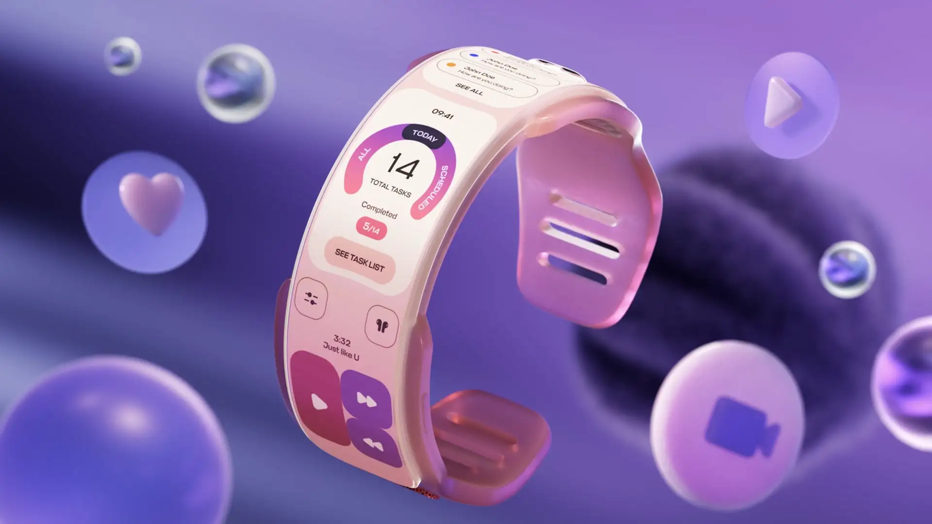
X-Pand adapts to your life - from hands-free audio and compact wearability to full-sized productivity and cinematic entertainment. For this product I created 3D motion video and a promo website.
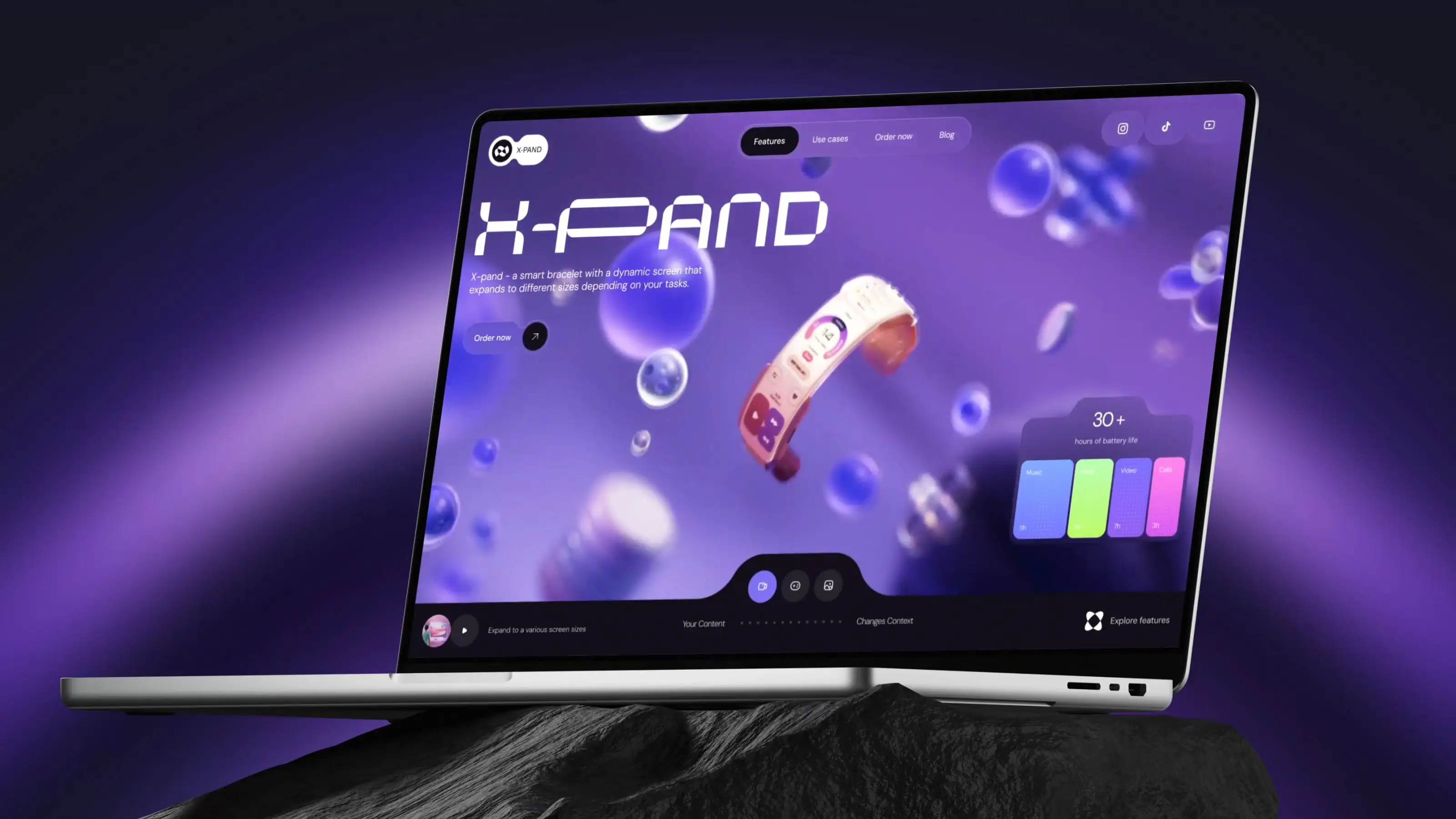
The X-Pand logo combines the letter “X” with the silhouette of the bracelet, creating a mark that works both as a typographic symbol and a representation of the product itself. The name X-Pand intentionally echoes the word expand, reinforcing the main idea behind the device. It represents a wearable that grows from a compact wristband into a larger interactive display. The result is a clean and memorable identity that communicates both the product’s function and its sense of motion at a glance.
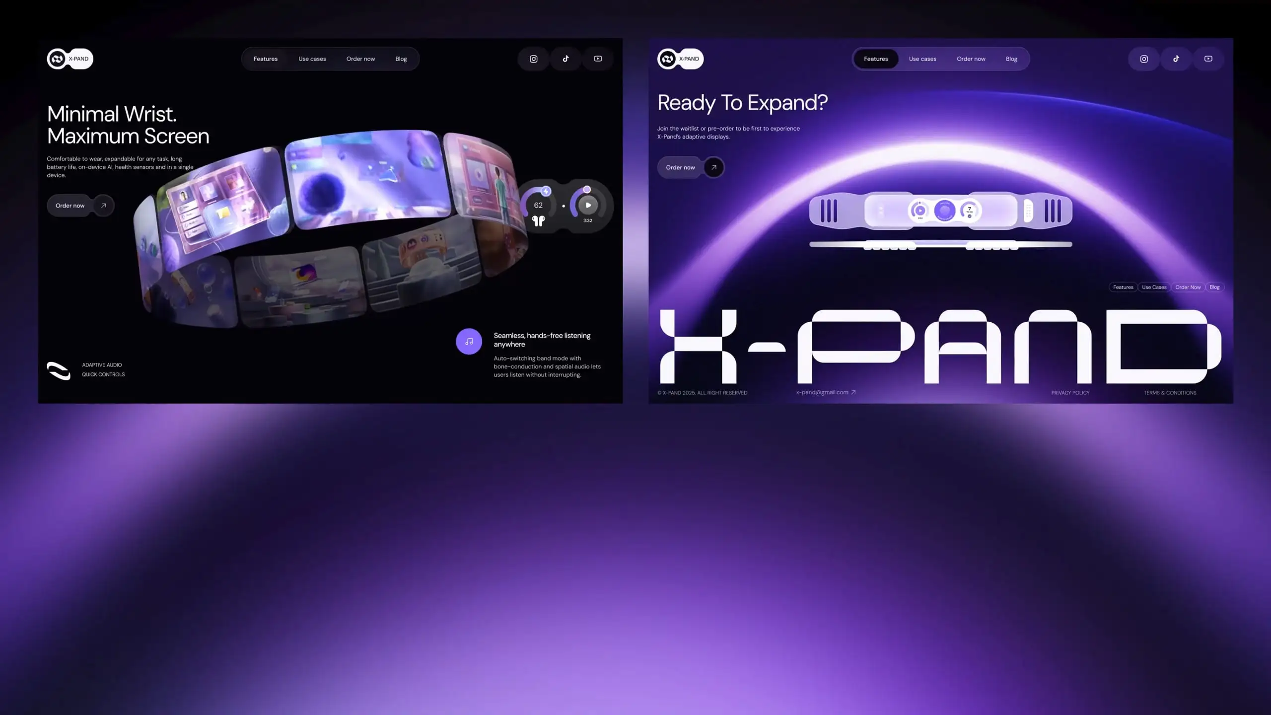
I designed a motion led website for X-Pand that greets visitors with a cinematic hero showing the bracelet smoothly expanding. The site then gently guides people through the product’s core features and short real world use cases, each paired with 3D scenes. Subtle animations echo the device’s expanding behavior so the experience feels tangible, and the layout reveals information as you scroll so visitors can quickly understand what X-Pand does.
I established a two-type system: Ncosmic for the hero and footer headers to give the brand a futuristic signature, and DM Sans for supporting headings and body copy to ensure clear, readable text at any size. The color palette was lifted from the promo video to keep the site visually continuous with the motion work.
I created a cinematic 3D promo, a focused brand identity, and a motion led website that make X-Pand’s expanding behavior instantly clear. To make the expansion believable at every size and keep the site fast, I defined a consistent motion language, pulled the color palette from the film for visual continuity, and built lightweight reusable components. The result is a cohesive, demo ready experience that shows the product and makes people want it.
