


Raccord
Product design, Branding, 3D motion, 2D motion
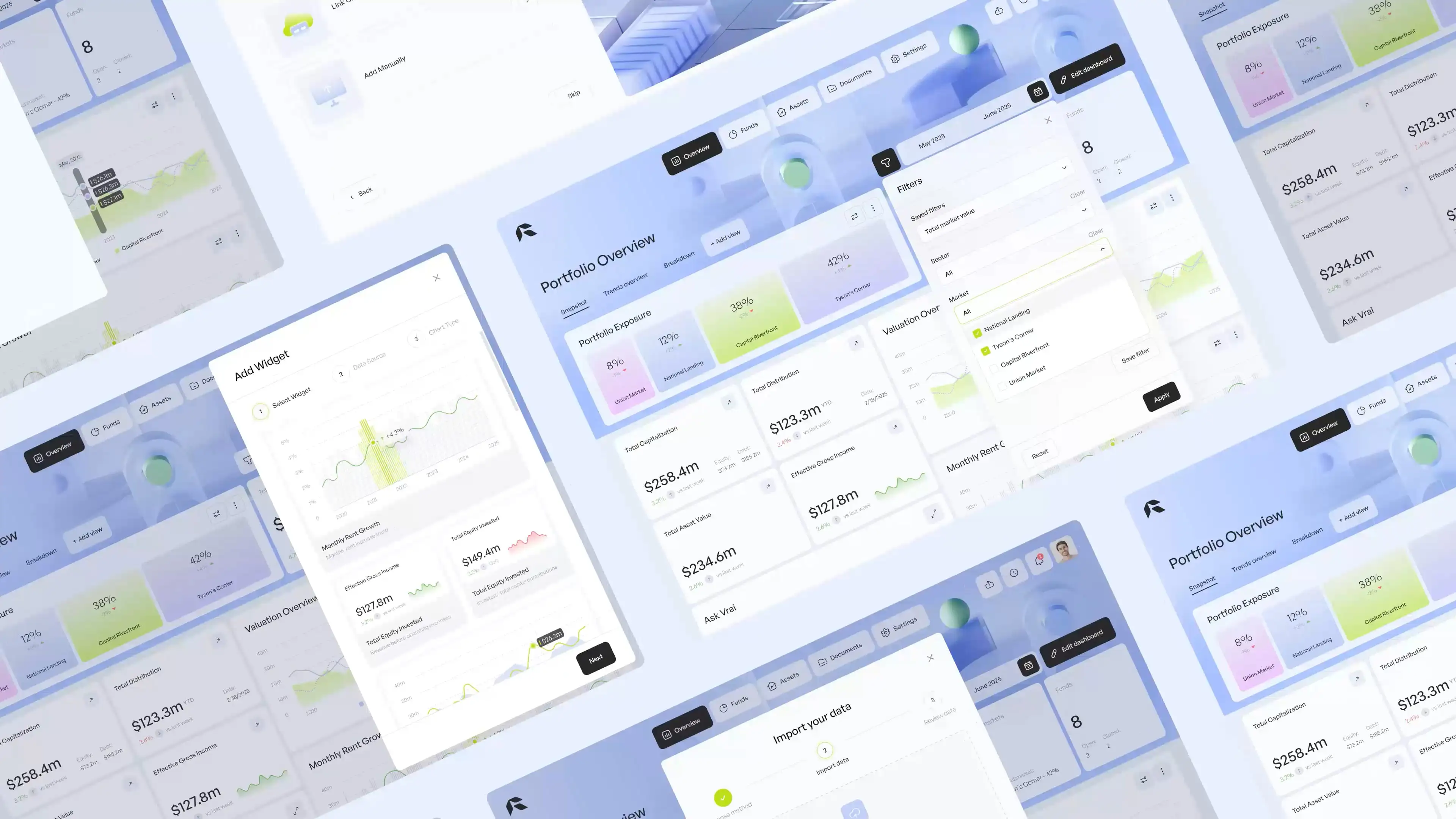
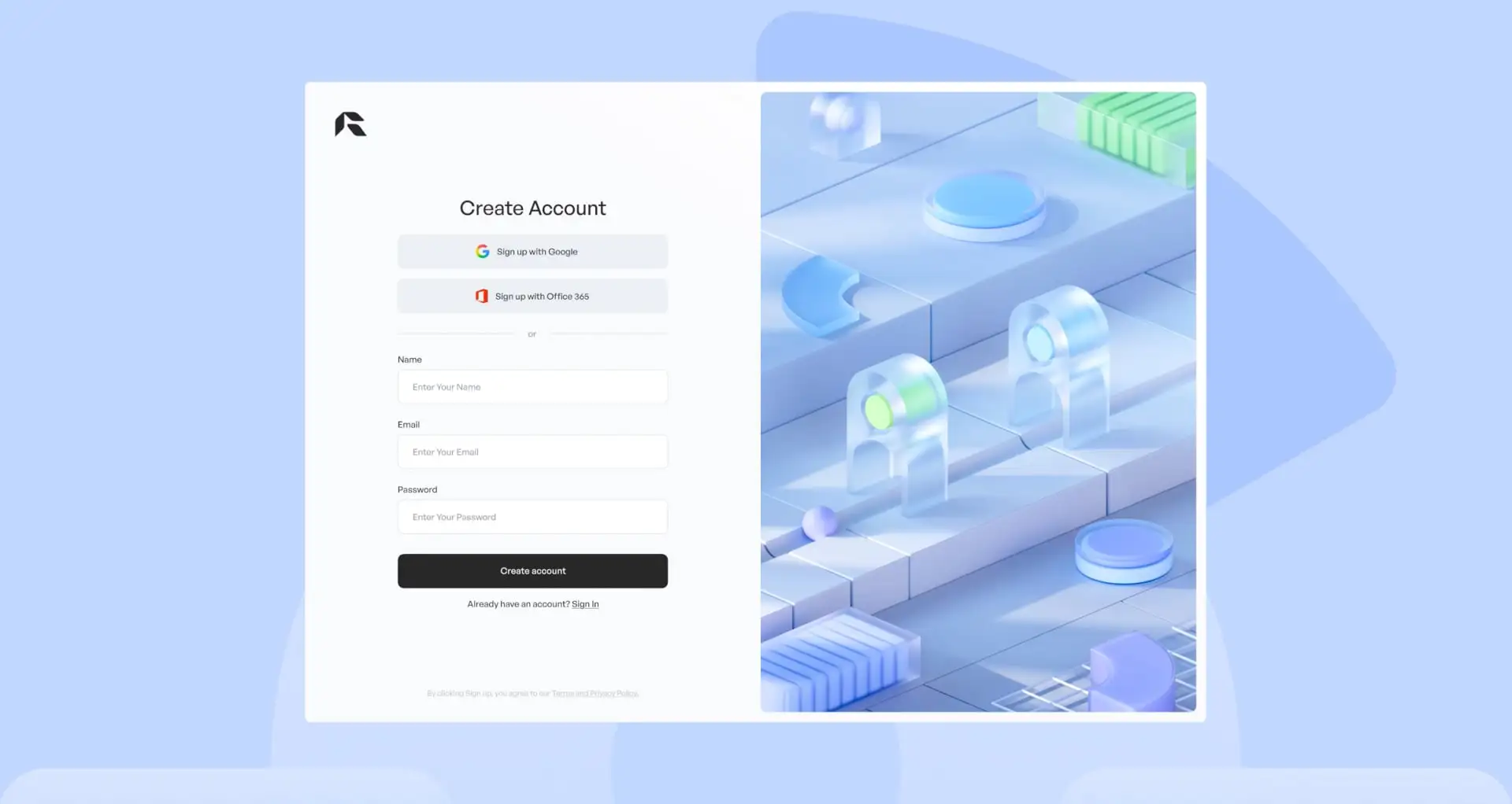
A concept project designed to show what a streamlined, modern investment experience could look like. The case focuses on clean, intuitive UI, with smart onboarding flows and flexible dashboard personalisation to match different user goals and preferences.
1. Create a unique branding and visual experience including motion. 2. Increase dashboard engagement and personalisation. 3. Enhance data clarity. 4. Reduce time to insight. The part of the user flow I worked on:
First‑time users land on a blank dashboard with no guidance.
Implemented a 4‑step onboarding wizard that lets users pick KPIs and import their first asset inline, so they arrive at a fully populated, personalized view on day one.
Customization controls are hidden and hard to discover.
Introduce a dedicated “Edit Mode” that reveals drag‑and‑drop handles and an “+ Add Widget” tile, making layout changes and new widget additions immediately obvious and accessible.


Chart settings are buried in menus with no live feedback.
When in the Edit mode there is a slide‑in configuration panel that shows a live preview of each tweak, so users can adjust chart types, axes, and filters in context and with confidence.

For Raccord, the goal was to turn a complex investment platform into a clearer and more engaging experience. I created a distinct brand identity and motion style that connected the product and its marketing. The dashboard was redesigned to improve personalization, clarify data, and help users reach insights faster, while a lightweight design system and motion assets ensured consistency for future product development.
